Alto Cloud Logo Design

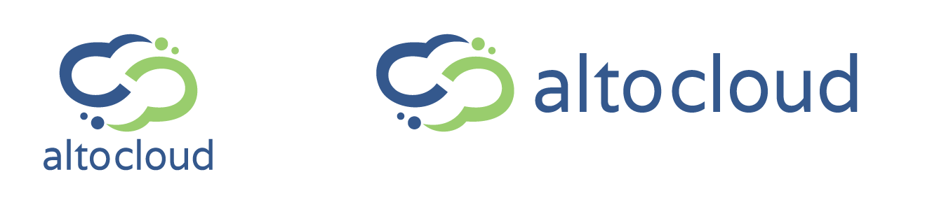
Finalized Versions
Process Images Sent to Company:
The company brought a previously designed logo that they liked, but wanted an updated, more 'apple flat' style logo.
After creating a new vector and fixing things like spacing and tilt, we talked colors and I produced this image showing
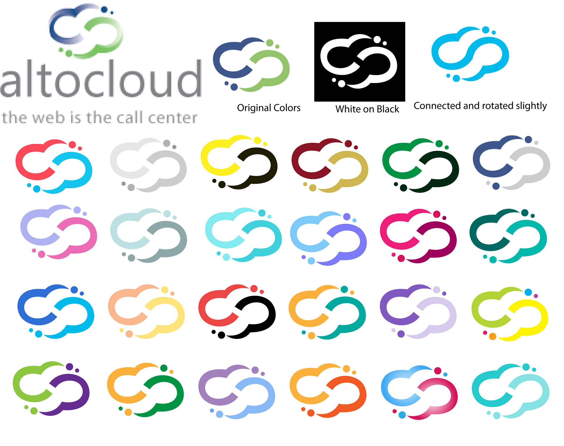
We went with colors close to, but not exactly the ones in the original. A slightly lighter blue and a softer green.
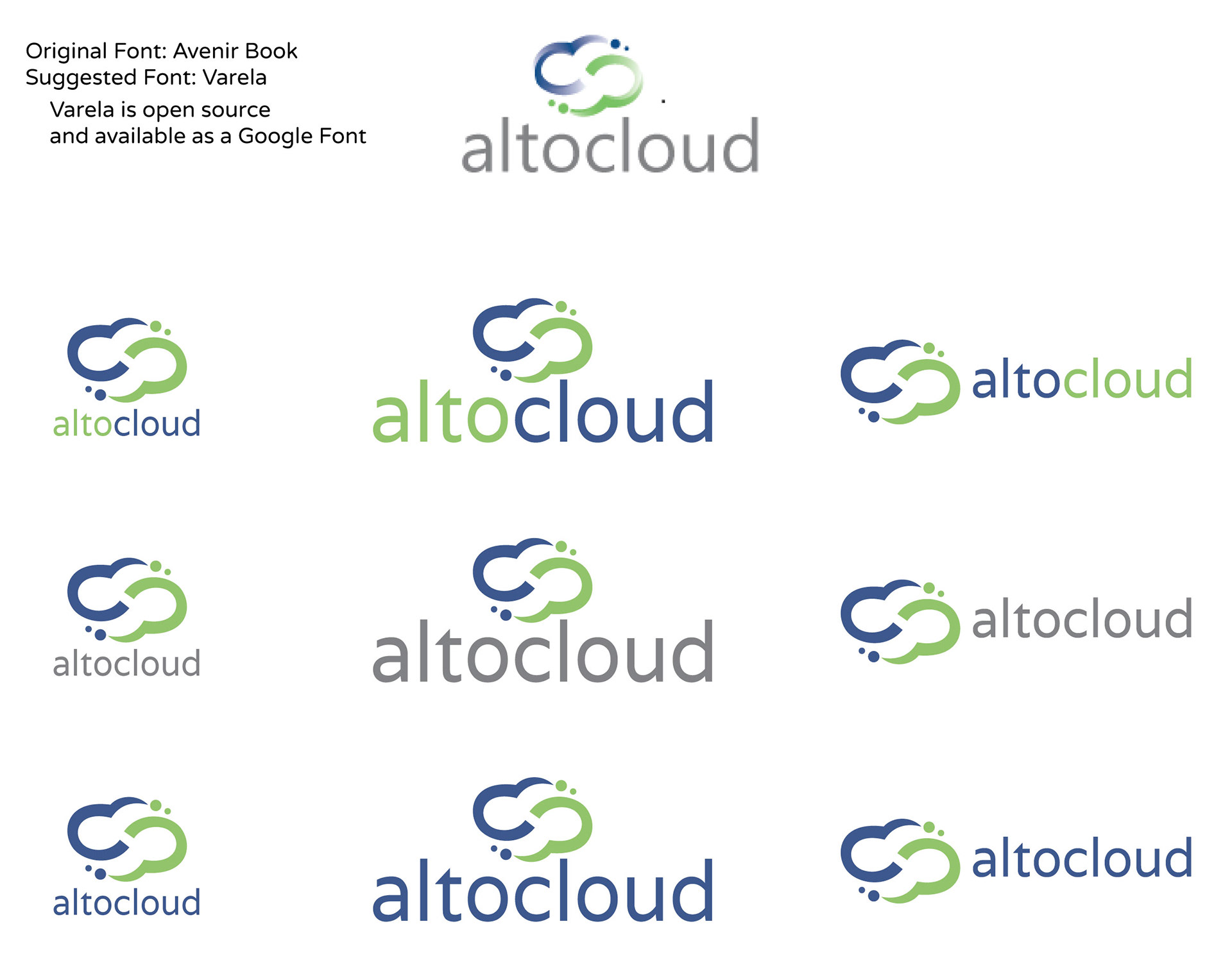
I then suggested an alternate font style, an open source font that could be used on the website as well as in the logo.
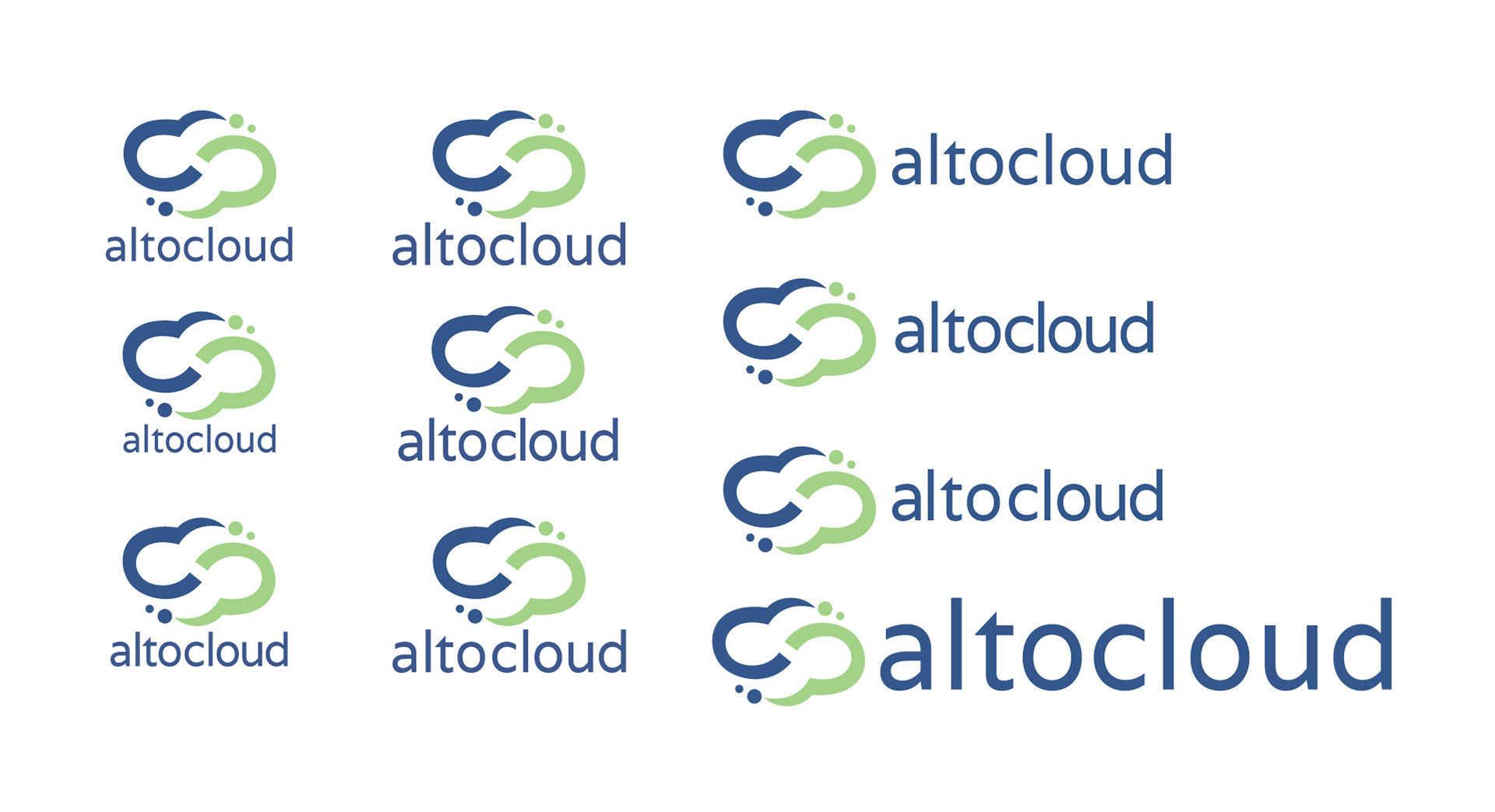
Final step in the design was Kerning the font to the right specifications to create the right look. The company did not want the words to appear to be seperate, so the gap between "alto" and "cloud" had to be uniform with the rest of the letters
Last was the creation of different pngs for the logo, different sizes and some black and white ones for print. Since they won't show up on this page, I've just left the black on white and the transparent one. I delivered many
Sizes ranged from 100px to 2400px in each variation