
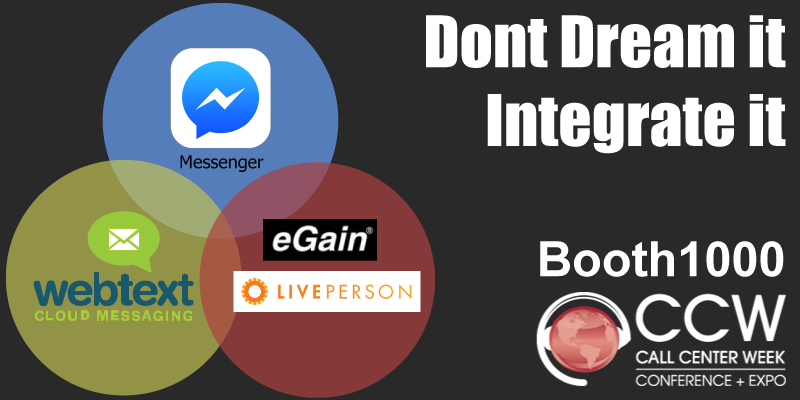
I was consulting for webtext, a cloud messaging company and we were doing a promotion during the Call Center week conference. The image they were planning to use for their twitter campaign wasn't optimized for the platform, nor did I believe it was "catchy" enough to draw attention.
Taking their marketing concept, shown at the bottom of this page for reference, I created a vectored image recreating the concept.
My first thought was to drastically improve the color choices to be more attention grabbing, particularly against the white's and blues of the twitter platform. I then played with the placement, since the original was much too small to really work on the platform.
Since this campaign was specific to the Call Center Week conference, I made two versions. One which could be used outside of the conference for general marketing use, merely including the webtext logo for clarity. The second being specific for the conference, including the conference Logo, and the webtext booth number. For conference work, I've found that including the booth number of the company helps drive traffic to the IRL booth, thus adding to more leads for the company in question.
Finally, I came up with the two line catchphrase - "Don't Dream it, Integrate it" - summarizing succinctly what our product did without wasting time, while also giving the reader a sense of "potential accomplishment" and an aspirational feel.
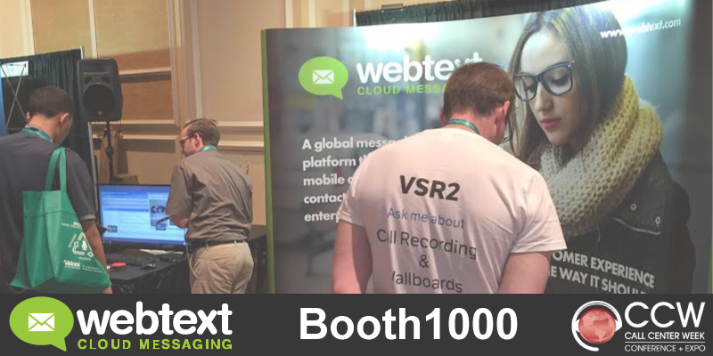
Alternate image for the ad campaign taken from a picture taken at the conference. Picture sent to me by webtext.
Original Image provided by webtext:

This was the original image given to me. I was told to replace the CISCOlogo with eGain and LIVEPERSON, but I knew this image wouldn't drive traffic to our site or our booth. For one thing the quality was terrible, even in the version sent to me, for another it was the wrong shape and size for the twitter platform. The colors were also rather atrocious. Who uses taupe in a Ven diagram anyway?